Do Television Series Decline Over Their Run? Evidence from 192,720 IMDb Episode Ratings
Tarık Şahar · Istanbul Technical University, Data Science and Analytics
Data snapshot: 22 July 2026 · Companion to the narrative essay in
essay.md; all design decisions are logged in
decisions.md.
Abstract
The belief that television series decline over their run is widely held and rarely measured. Using the complete IMDb episode-rating corpus, we construct a panel of 192,720 rated episodes from 3,234 series and estimate a per-show quality trajectory as the slope of a vote-weighted least-squares fit of episode rating on normalised episode order. We find the folk belief is false for the typical series: only 16.9% of shows decline by at least half a rating point across their entire run, 57.4% are essentially flat, and 25.7% clearly rise. A coupling-free test — regressing each show’s second-half mean on its separately measured first-half mean — yields a correlation of +0.793 and a slope of 0.886 against a noise-only expectation of 0.983, implying a real but negligible extra decline of 0.07 rating points for the strongest starters. Season finales exceed the remainder of their own season 72.6% of the time, and series finales exceed their final season 71.6% of the time, so the moment the belief expects collapse is typically a local maximum. Among ended series the final season is weaker than the rest of the run in 50.5% of cases with a median change of -0.006, and only 12.6% lose half a point or more; this conclusion is insensitive to the threshold chosen. Decline is concentrated rather than general: show length (-0.026 per season, t = -6.8) and premiere year (+0.048 per decade, t = +4.8) each survive mutual adjustment, whereas genre is largely uninformative once age and length are controlled. The model explains only 6.0% of between-show variance, so these are reliable but small effects. Finally, the belief describes the series it is drawn from better than the population: the clear-decline share rises monotonically with a series’ vote count, reaching 43.3% among the 60 most-watched series against a 16.9% base rate, and this gradient survives controls for precision, length and era. Because vote counts respond to disappointment as well as recording it, we report this as descriptive; it offers a measured account of how a belief this durable coexists with evidence this consistent.
Keywords: television ratings, quality trajectories, regression to the mean, availability bias, IMDb
1. Introduction
That television series deteriorate over time is close to received wisdom. The claim is specific enough to be testable — it asserts that a show’s quality declines monotonically or near-monotonically with time on air — yet it is usually supported by enumeration of memorable cases rather than by measurement.
This report tests the claim directly. We ask six questions:
- What is the distribution of per-show quality trajectories?
- Is a show’s later quality predictable from its earlier quality, and does high early quality decay?
- Do finales — season and series — underperform, as the belief implies?
- Is there a “final-season curse”?
- If decline exists, which show characteristics predict it?
- Does the belief describe the series it is actually drawn from — the widely-watched ones — better than it describes the population?
Our contribution is not a new method but a disciplined application of standard ones to a question usually argued anecdotally, with explicit attention to the artefacts that make naive versions of this analysis produce the opposite answer. Section 5 documents five such artefacts, one of which produced an apparently strong effect that survived neither reformulation nor replication.
2. Data
2.1 Source
All ratings come from the IMDb public datasets [1], downloaded on
22 July 2026. IMDb republishes these files daily; counts drift as new
episodes accumulate ratings and borderline series cross inclusion thresholds,
so the exact figures below are reproducible only against the committed
snapshot in data/processed/.
Three tables are used:
| Table | Role |
|---|---|
title.episode |
maps each episode to its parent series, season and episode number |
title.ratings |
mean rating and vote count per title |
title.basics |
title type, primary title, start year, end year, genres |
2.2 Construction
Episodes with a missing season or episode number are dropped, since ordering
within a series is required. The episode table is inner-joined to ratings — so
only episodes carrying at least one vote survive — and then to the series rows
of title.basics restricted to tvSeries and tvMiniSeries. Episodes are
ordered by season then episode number, and a within-show sequential index
overall_order is assigned. Series with an empty endYear are flagged
ongoing rather than dropped. The result is one row per rated episode
(src/build.py → data/processed/episodes.parquet).
2.3 Inclusion criteria
Six filters define the analysis population:
| Criterion | Threshold | Rationale |
|---|---|---|
| Title type | tvSeries or tvMiniSeries |
excludes films, specials, episodes as titles |
| Rated episodes | ≥ 13 | a trajectory requires enough observations to estimate |
| Seasons | ≥ 2 | “decline across seasons” is undefined for one season |
| Mean votes per episode | ≥ 50 | limits measurement noise from thinly-rated series |
| Genre exclusions | not Game-Show, Reality-TV, Talk-Show, News | non-narrative formats have no season arc to decline |
| Documentary cap | Documentary-tagged kept only if < 100 episodes | separates season-based documentary series from magazine strands |
The documentary rule is platform-independent, since the data carry no channel
or platform field. Full rationale for each threshold is in decisions.md.
2.4 Sample
| Property | Value |
|---|---|
| Series | 3,234 |
| Rated episodes | 192,720 |
| Total votes represented | 160,926,754 |
| Premiere years | 1949–2026 |
| Ongoing at snapshot | 524 (16.2%) |
| Episodes per series | median 36 (IQR 22–69, max 1,234) |
| Seasons per series | median 3 (IQR 2–5, max 70) |
| Mean rating per series | median 7.72 (IQR 7.39–8.03) |
| Votes per episode | median 190 |
The sample is right-skewed in length: 485 series exceed 100 episodes and 127 exceed 200. These were retained rather than trimmed; the trajectory metric normalises episode order to [0, 1] so that run length cannot mechanically inflate a slope, and length is analysed as an explanatory variable in its own right (§4.5).
3. Methods
3.1 Per-show trajectory
For each series, let $x_i \in [0,1]$ be the normalised position of episode $i$ in the run and $y_i$ its mean rating. We fit
\[y_i = a + b x_i + \varepsilon_i\]by weighted least squares with weights $w_i = \sqrt{v_i}$, where $v_i$ is the episode’s vote count.
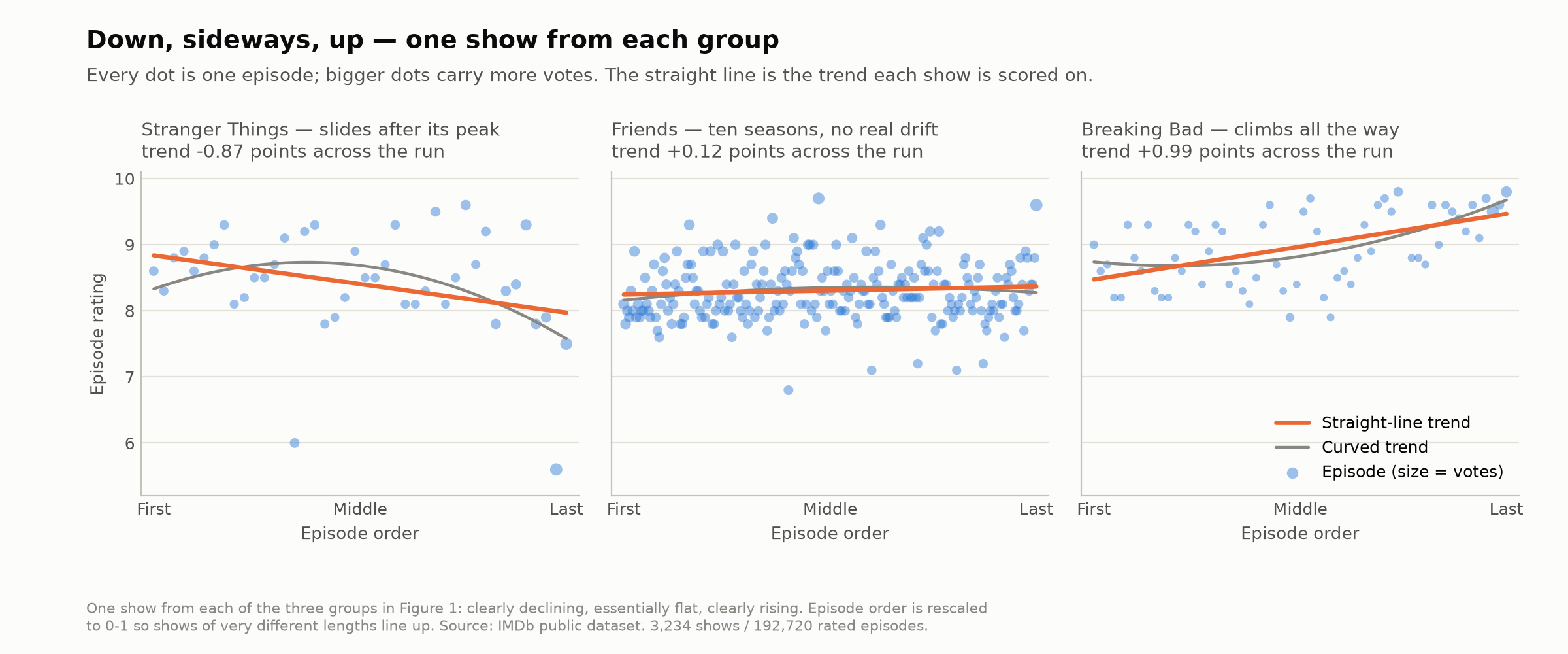
Figure 1. Three fitted trajectories, one from each outcome band defined below. Points are episode means sized by vote count; the straight line is the estimate $\hat{b}$, the grey curve the quadratic of §3.3.
The estimate $\hat{b}$ is the show’s trend: the rating points gained or lost between first and last episode. A show is classified as clearly declining if $\hat{b} \le -0.5$, clearly rising if $\hat{b} \ge +0.5$, and essentially flat otherwise. The half-point cut is a perceptibility convention, not a statistical one; §5.6 examines what estimation error costs it. (The threshold sweep in §5.3 is over the final-season cut of §3.2, a different quantity.)
Choice of weights. Vote counts vary substantially within a series (median max/min ratio 3.5, exceeding 10 for a tenth of series), so an unweighted fit lets a 51-vote episode influence the trend as much as a 500,000-vote one. Weighting by $v_i$ directly is optimal under an i.i.d.-votes noise model, but IMDb vote counts violate it: notorious episodes attract votes for reasons unrelated to measurement precision. In Game of Thrones, four of the six most-voted episodes belong to the final season and all are rated far below the series mean; linear weighting nearly doubles the fitted slope relative to an unweighted fit (-2.206 vs -1.024), while $\sqrt{v_i}$ gives -1.546. Log-weighting was also examined and is nearly indistinguishable from unweighted in practice. We therefore use $\sqrt{v_i}$ throughout.
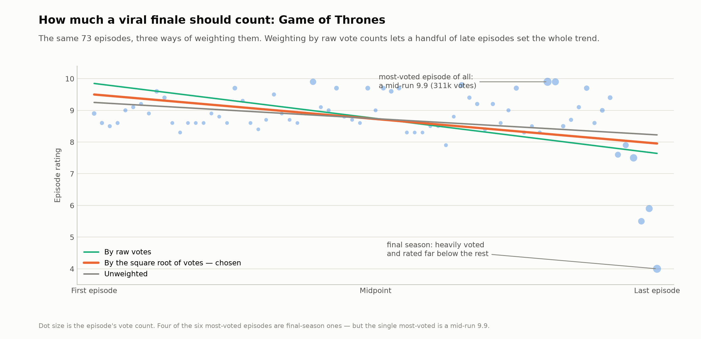
Figure 2. The same 73 episodes under three weighting schemes. Raw vote weighting lets the heavily-voted final-season cluster set the trend for the whole run; the single most-voted episode is in fact a mid-run 9.9.
3.2 Final-season effect
The slope in §3.1 answers “does this series decline at a roughly constant rate”, which is not the final-season question: a straight line fitted across all episodes is anchored by the majority and understates a late, sharp drop. For Game of Thrones the true season-8 mean is 6.40 against 8.95 for seasons 1–7, yet the fitted line predicts 7.6–8.3 in that range under every weighting scheme. We therefore define, for ended series only,
\[\Delta = \bar{y}_{\text{final season}} - \bar{y}_{\text{all earlier episodes}}\]and use $\Delta$ for all final-season claims. A series is termed clearly cursed if $\Delta \le -0.5$.
3.3 Trajectory shape
A weighted quadratic $y = a + bx + cx^2$ is fitted per series with the same weights. Where the vertex $-b/2c$ lies inside $[0.15, 0.85]$ and $|c| > 0.05$, the series is labelled jumped-the-shark ($c<0$: interior maximum) or found-itself ($c>0$: interior minimum); otherwise straight line, meaning the fitted curve has no turning point inside the observed run and is monotone over it. Note this last class is not “flat”: it contains steep monotone decliners and risers alike. Volatility is the weighted RMSE of the linear fit’s residuals.
3.4 Peak location
For each series we take the argmax of season means, reported both as an absolute season number and as a normalised rank $(\text{rank}-1)/(n_{\text{seasons}}-1)$. Because the sample is dominated by short series, aggregate statements about the peak are reported stratified by season count (§4.6).
3.5 Cross-sectional model
To separate era, length and genre we estimate by OLS
\[\hat{b}_j = \beta_0 + \beta_1 \text{year}_j + \beta_2 \text{seasons}_j + \beta_3 \text{ongoing}_j + \sum_g \gamma_g \, \mathbb{1}[g \in \text{genres}_j] + u_j\]over all $n = 3{,}234$ series, with premiere year centred and genres entered as 16 non-exclusive indicators. Classical standard errors are reported; given the sample size and the magnitude of the leading $t$-statistics, robust alternatives would not change any conclusion drawn here.
4. Results
4.1 The distribution of trajectories
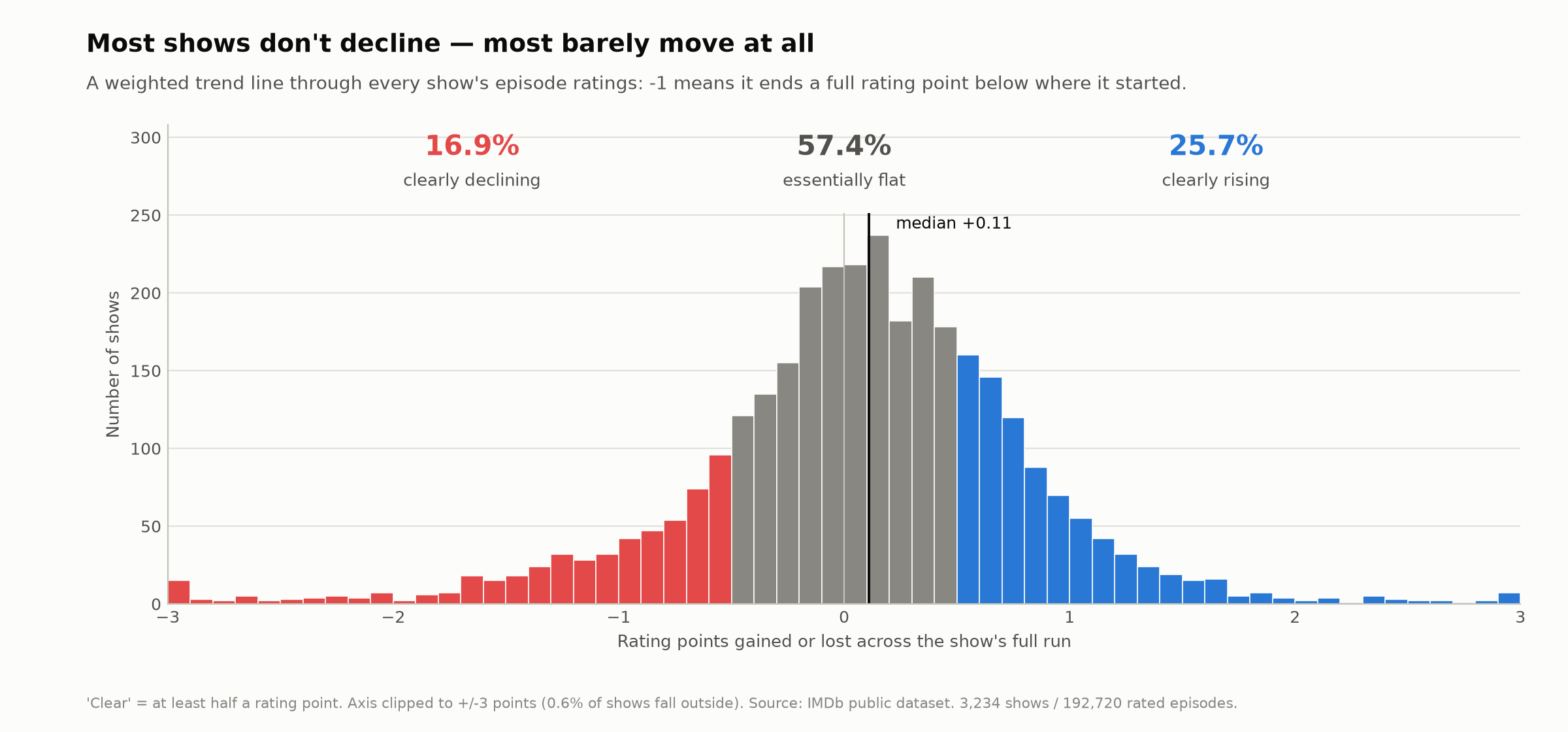
Figure 3. Distribution of the per-show trend $\hat{b}$.
The trend distribution is centred slightly above zero (mean +0.073, median +0.109, SD 0.778, IQR -0.296 to +0.515). By sign, 57.4% of series trend upward and 42.6% downward. By magnitude, 16.9% decline clearly, 57.4% are essentially flat, and 25.7% rise clearly. Under the folk belief we would expect a distribution massed below zero; we observe a distribution massed at zero with a mild positive tilt.
4.2 Stability across a series’ run
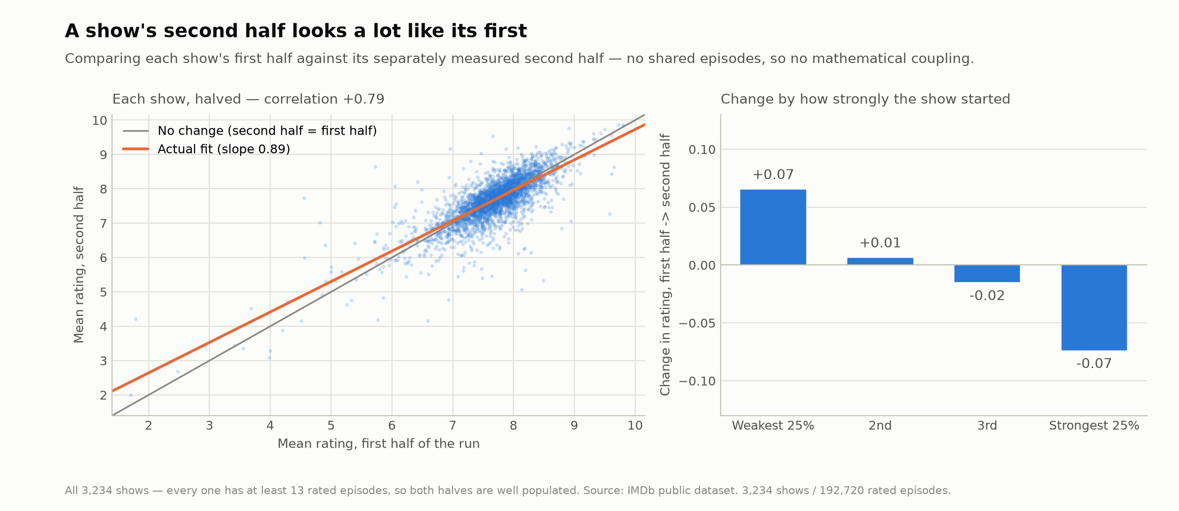
Figure 4. Each series’ first-half mean against its separately measured second-half mean.
Splitting each series into disjoint halves, first-half and second-half means correlate +0.793. Regressing second on first yields a slope of 0.886, below unity and therefore consistent with some regression to the mean. The relevant benchmark is not 1 but the reliability of a half-mean: an odd/even split-half correlation with the Spearman–Brown correction [2, 3] gives 0.983, which is what a pure “stable quality plus measurement noise” process would produce. The observed 0.886 falls modestly below this, so a genuine extra decline of strong starters exists — but it is very small. In levels, top-quartile starters (first-half mean 8.32) lose 0.07 rating points in their second half, and bottom-quartile starters (6.94) gain 0.07.
4.3 Finale structure
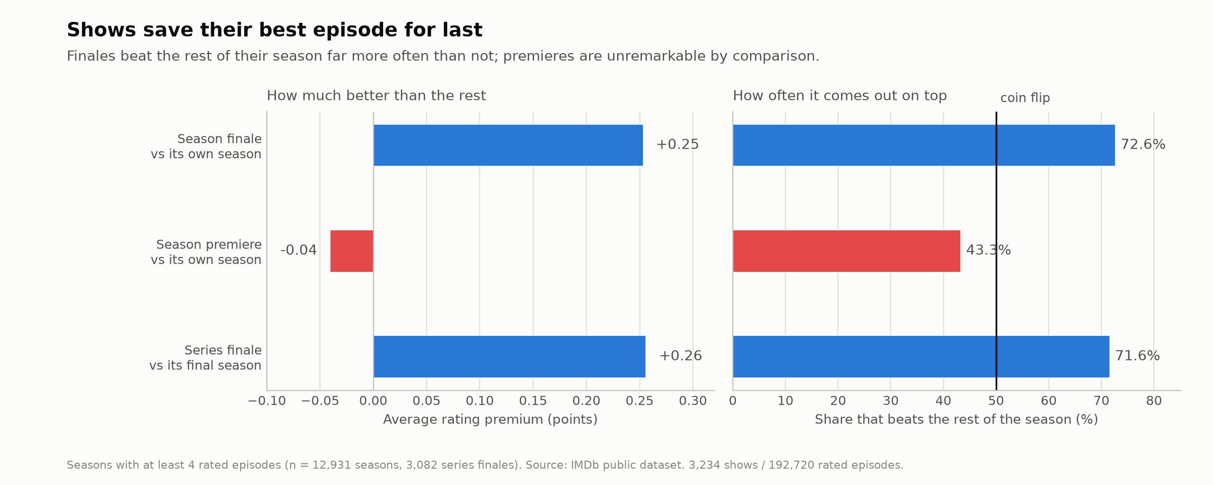
Figure 5. Finale and premiere premia relative to the rest of the season.
Restricting to seasons of at least four rated episodes (n = 12,931 seasons):
| Contrast | Mean | Share above baseline |
|---|---|---|
| Season finale vs rest of its season | +0.253 | 72.6% |
| Season premiere vs rest of its season | -0.040 | 43.3% |
| Series finale vs its final season body (n = 3,082) | +0.256 | 71.6% |
Finales are systematically the strongest episode of their season, premieres are mildly below average, and the asymmetry is large. Only 9.4% of series finales fall 0.5 points or more below their final season — the memorable “finale flop” is a one-in-ten event.
4.4 The final-season effect
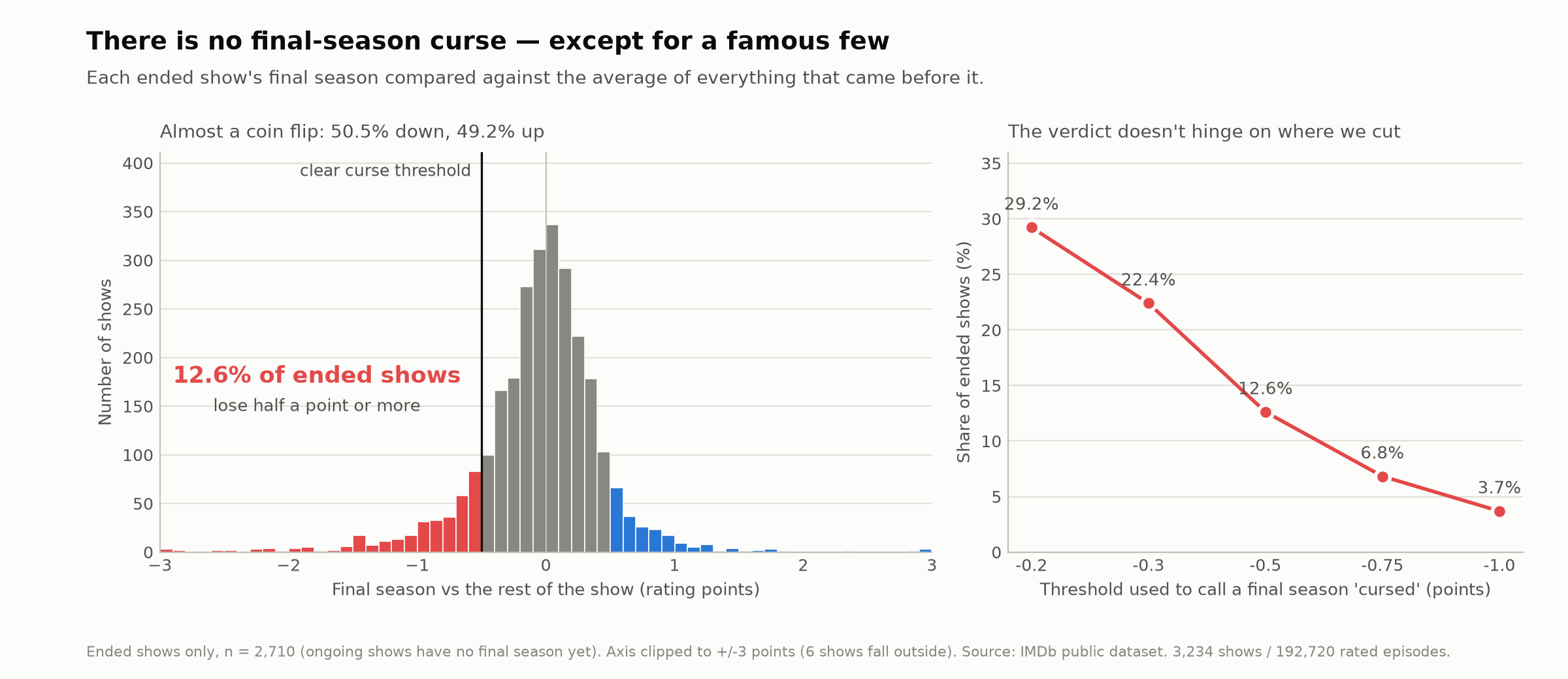
Figure 6. Distribution of $\Delta$ for ended series, with a sensitivity sweep over the “cursed” threshold.
Across 2,710 ended series, 50.5% have a weaker final season and 49.2% a stronger one (ten end exactly level), with median $\Delta = -0.006$ and mean $-0.049$. 12.6% are clearly cursed at the -0.5 cut. The cursed minority is dominated by well-known series (House of Cards -4.24, Game of Thrones -2.55, Master of None -2.54, The Promised Neverland -2.28), which suggests the mechanism sustaining the belief: the observable instances are disproportionately the famous ones.
That is measurable rather than merely illustrative. Cutting $\Delta$ by series popularity gives a monotone gradient — 11.6% clearly cursed among series under 5,000 votes, 12.5%, 14.4%, and 23.8% among the 42 household names above 500,000, with median $\Delta$ moving from +0.063 to -0.209. The top tier is small and its interval correspondingly wide (95% Wilson score [8] 13.5–38.5%), so this is the weaker of the two fame gradients we measure; the slope-based one in §4.7 is sharper and better powered. Both carry the endogeneity caveat stated there.
$\Delta$ and $\hat{b}$ correlate +0.80, so roughly a third of their variation is independent and they are not interchangeable. Notably, the pure “flat then cliff” case is essentially absent: all 32 series with $\Delta \le -1.0$ and at least 30,000 votes also have a negative overall slope, which is mechanical — a late crash necessarily tilts a fitted line downward.
4.5 Era, length and genre
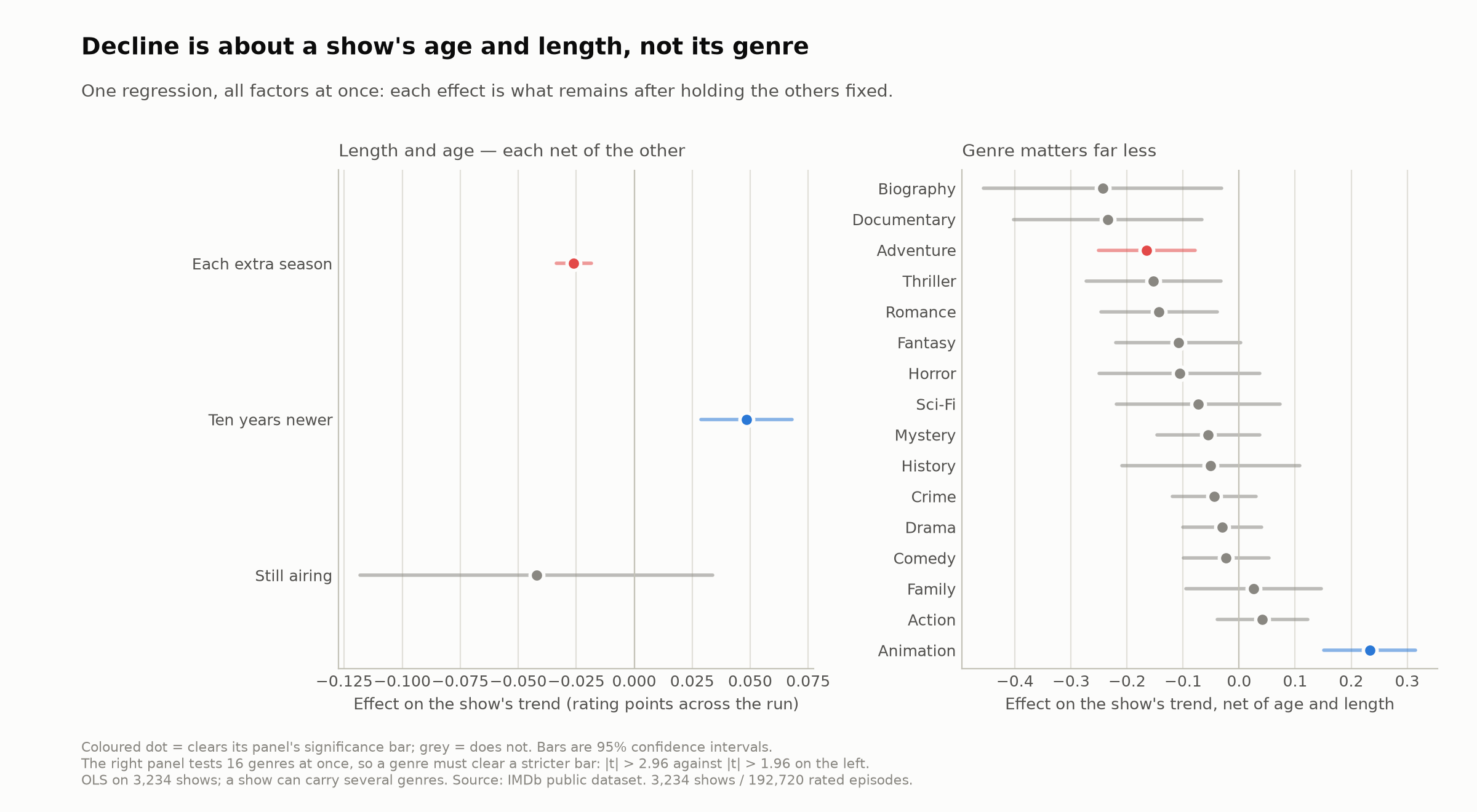
Figure 7. OLS coefficients with 95% confidence intervals. The genre panel screens 16 coefficients simultaneously and so uses a Bonferroni-corrected bar ($|t| > 2.96$); the era/length panel tests pre-specified single hypotheses and uses $|t| > 1.96$. Under Benjamini–Hochberg, Documentary, Romance and Thriller would also be coloured; Biography would not.
Raw cross-sectional cuts are heavily confounded: median seasons per series falls from 5 in the 1950s to 2 in the 2020s while the ongoing share rises from 3% to 41%. After mutual adjustment (full table in Appendix A):
- Length: $-0.0261$ per season ($t = -6.78$). Ended 2–3-season series average $+0.217$; ended 6+-season series $-0.120$, with 60.8% of 6+-season series declining.
- Era: $+0.0048$ per year, i.e. $+0.048$ per decade ($t = +4.81$). The effect survives restriction to ended series and to fixed length bands, so it is not a length or ongoing-status artefact. 59.3% of pre-2000 series decline against 38.6% of later ones.
- Genre: six of the sixteen genre indicators reach significance individually, but sixteen simultaneous tests are expected to produce about 0.8 spurious flags at $\alpha = 0.05$, so the family requires a correction. Only Animation ($+0.233$, $t = 5.57$) and Adventure ($-0.165$, $t = -3.75$) survive Bonferroni ($\alpha = 0.0031$, $|t| > 2.96$). Benjamini–Hochberg [7], which controls the false discovery rate and is the more appropriate screen for a set of exploratory indicators, additionally retains Documentary ($-0.235$), Romance ($-0.143$) and Thriller ($-0.153$). Biography ($-0.244$, $t = -2.25$) survives neither and is not reported as an effect: it is the weakest of the raw six and rests on 53 series. Drama, Comedy, Crime and Action — the bulk of the sample — are indistinguishable from zero under any threshold.
The model explains 6.0% of between-show variance ($R^2 = 0.0603$, residual SD 0.756). The effects are estimated precisely but are small relative to the idiosyncratic differences between series; no combination of a show’s age, length and genre comes close to determining its trajectory.
4.6 Shape and peak location
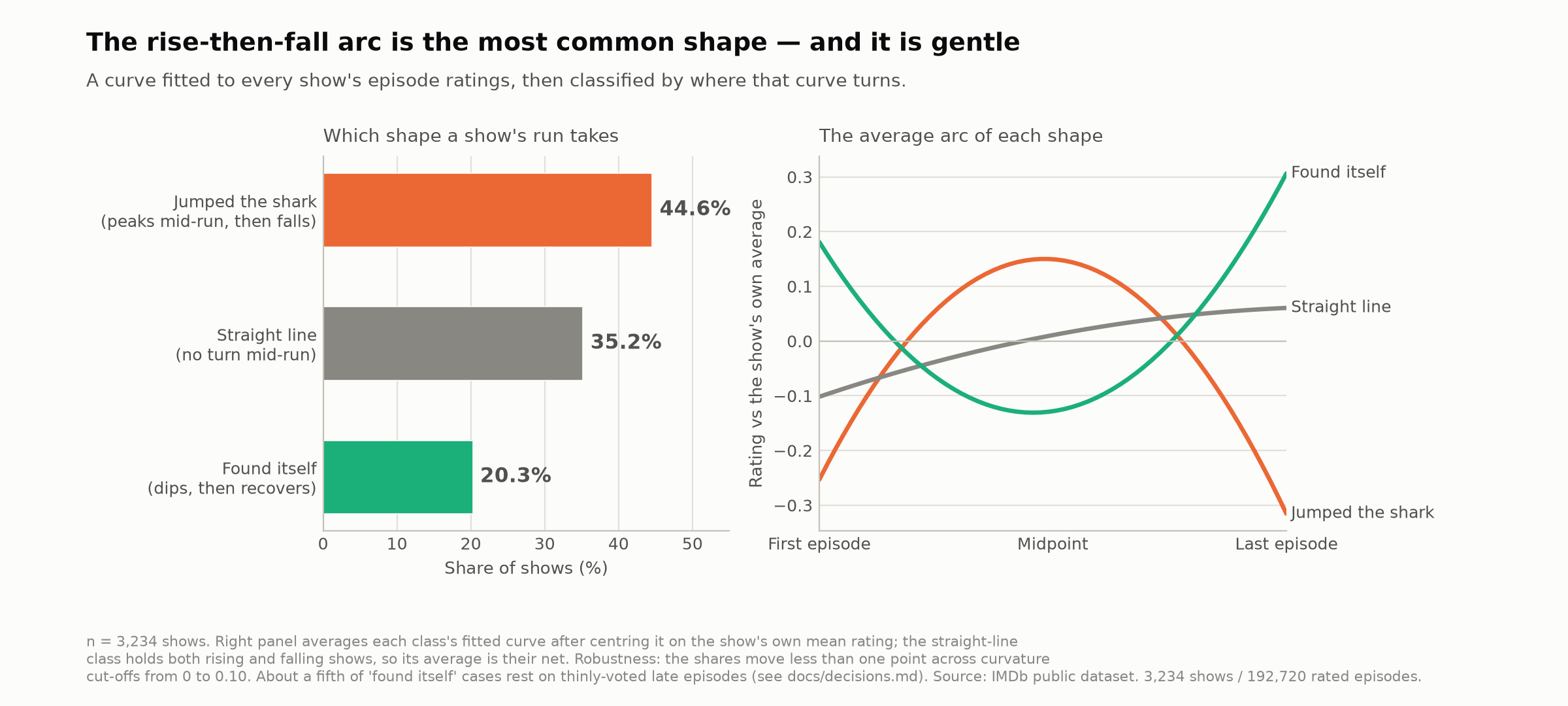
Figure 8. Share of series by trajectory shape and the mean fitted arc of each class.
The rise-then-fall arc is the single most common shape (44.6%), against 35.2% straight-line and 20.3% found-itself. Within the jumped-the-shark class the vertex sits at a median normalised position of 0.50, with only 6.2% of peaks in the 0.15–0.25 band, so the label describes a genuine interior maximum rather than a decline from the outset. The arc is nonetheless shallow: median rise to the peak is 0.37 rating points and median fall from it 0.33. The classification is insensitive to the curvature cut-off — class shares move from 44.6/35.1/20.3 at a threshold of 0 to 43.7/36.6/19.8 at 0.20 — because the binding condition is the location of the vertex, not the size of $c$.
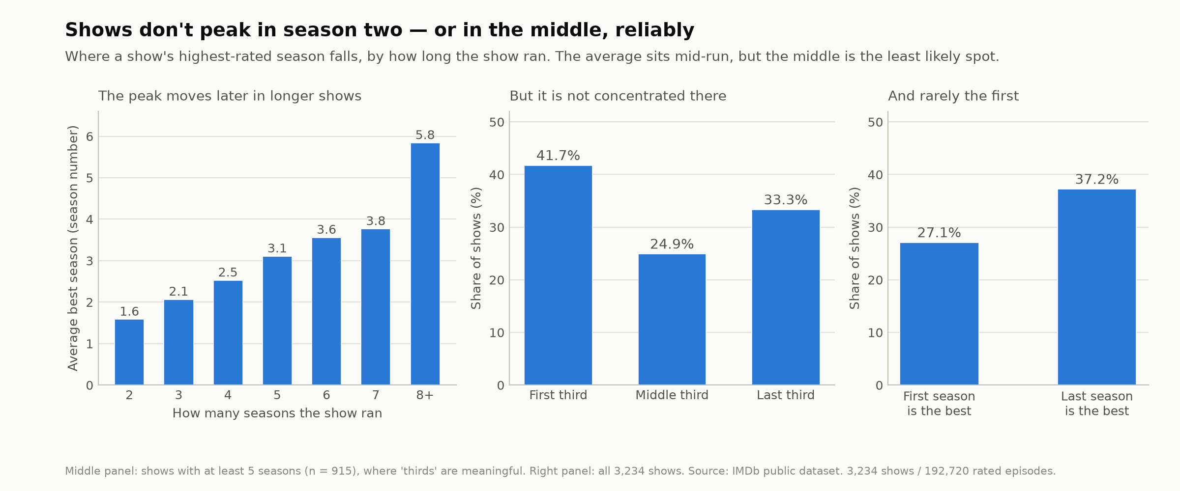
Figure 9. Location of the best season by series length.
The mean best season rises with run length (1.6 at two seasons, 2.5 at four, 3.1 at five, 3.8 at seven, 5.8 at eight or more) while its normalised position remains near the middle (0.46–0.59 across all lengths). An earlier cut on three-season series alone suggested a “sophomore surge”; that is an aggregation artefact of a sample dominated by short series, in which season 2 is the middle. Importantly, the mean masks the distribution: among series with at least five seasons (n = 915), the peak falls in the first third 41.7% of the time, the middle third 24.9%, and the last third 33.3% — the middle is the least likely location, and the mean sits at 0.5 only because the ends balance. Finally, the last season is the single best season 37.2% of the time against 27.1% for the first, contradicting the “first season is always best” claim in aggregate.
4.7 Popularity and the provenance of the belief
§4.1 is a statement about the average series. The belief under test is not formed from the average series: it is formed from the few dozen titles a mass audience has actually watched. Whether those behave like the population is therefore a substantive question rather than a rhetorical one, and it is measurable using each series’ total vote count — the only popularity proxy the data carries.
| Tier | Series | Clear decline | 95% CI | Median $\hat{b}$ |
|---|---|---|---|---|
| Under 5,000 votes | 1,184 | 14.8% | 12.9–16.9 | +0.224 |
| 5,000–50,000 | 1,545 | 15.1% | 13.4–17.0 | +0.078 |
| 50,000–500,000 | 445 | 24.7% | 20.9–28.9 | −0.041 |
| Over 500,000 | 60 | 43.3% | 31.6–55.9 | −0.392 |
Intervals are 95% Wilson score intervals [8] for the clear-decline share; the top tier is small enough that a bare percentage would overstate its precision.
The gradient is monotone, and the most-watched tier declines at roughly three times the 16.9% base rate — an interval that does not overlap the least-watched tier’s. Three attempts to dissolve it all fail:
- Not a precision artefact. A noisier fit crosses a fixed $\pm 0.5$ cut more often by chance, so systematically noisier estimates among obscure series could manufacture the whole gradient. Median slope standard errors are essentially flat across the four tiers (0.207, 0.174, 0.191, 0.205): popular series have less noise per episode but genuinely bumpier ratings, and the two roughly cancel. The intuition that popular means better-measured is wrong here, which is why it was checked rather than assumed.
- Not the length effect in disguise. Popular series run longer ($r = 0.37$ between log votes and season count) and long series were already shown to decline. Holding the season band fixed, the gap survives in every band: 13.1% against 31.0% at 2–3 seasons, 15.1% against 36.6% at 4–5, and 23.2% against 38.2% at 6+ (obscure < 20,000 votes against popular $\ge$ 200,000).
- Survives era and length jointly. Regressing $\hat{b}$ on $\log_{10}$(votes), season count and premiere year gives $-0.134$ per tenfold increase in votes ($t = -6.2$), larger in magnitude than a whole extra season ($-0.019$) and estimated as sharply.
Vote count is endogenous, and no causal claim is available. This project documented the mechanism itself while choosing a weighting scheme (§3.1): a final-season backlash inflates vote counts, which is why four of Game of Thrones’ six most-voted episodes belong to season 8. Decline raises votes as surely as votes track decline, so the arrow cannot be pointed, and fame cannot be said to cause anything here.
What survives is descriptive. The series the belief is drawn from do not behave like the typical series, and “about one in six” is not a statement about them. This is offered as a reconciliation rather than a retraction: §4.1 remains the correct answer to “do series decline”, and this section explains why an honest viewer with a different sample would answer differently.
5. Robustness and threats to validity
5.1 Mathematical coupling
An early formulation correlated each show’s slope with its own fitted intercept, producing $r = -0.373$ and the apparent finding that high-quality series decline hardest. This is an artefact: both quantities are estimated from the same episodes and share noise, so the correlation is partly manufactured [4]. The disjoint-halves design in §4.2 removes the shared-noise channel entirely and reduces the effect to 0.07 rating points. We report the clean estimate and retain the biased one only as a documented negative result.
5.2 Metric–question mismatch
As shown in §3.2, a single linear slope cannot represent a flat-then-cliff trajectory and understates late crashes. Using the slope as a proxy for the final-season question would have understated Game of Thrones’ season-8 drop by roughly 1.2–1.9 rating points. All final-season claims therefore use the direct season contrast.
5.3 Threshold sensitivity
The “clearly cursed” share is 29.2% at $\Delta \le -0.2$, 22.4% at $-0.3$, 12.6% at $-0.5$, 6.8% at $-0.75$ and 3.7% at $-1.0$: the conclusion that cursed final seasons are a minority holds at every reasonable cut. As a scale-free check we also computed $\Delta$ divided by the SD of the series’ own non-final-season episode ratings; 23% of ended series reach a “large” effect in Cohen’s conventional sense [5], and 98% of series flagged by the raw -0.5 rule also clear the large-effect bar, so the intuitive and principled criteria select nearly the same set.
5.4 Low-vote tails
Within a series, episode position correlates $-0.74$ with log vote count: later episodes are systematically less voted. Any late-leaning result is therefore on weaker ground than an early-leaning one. This matters most for the found-itself class: the median last-third episode carries only ~132 votes and 39.7% of found-itself series have a last third averaging under 100 votes. Re-fitting after dropping sub-100-vote episodes, 56.5% of found-itself series retain the label, 20.2% revert to decline or flat, and 23.4% become untestable. The label is not a weighting artefact (94.5% survive an unweighted refit) but roughly a fifth of it is a thin-data artefact, and we treat it accordingly.
5.5 Confounding
“Newer series rise”, “shorter series rise” and “older series decline” are not three findings: newer series are shorter. The §3.5 specification holds each fixed, and both era and length survive. We additionally verified the era effect within ended series and within a fixed 2–3-season band, where it does not fade.
5.6 Estimation error in the trend
Each $\hat{b}$ is an estimate, and §4.1 sorts estimates into bands cut at $\pm 0.5$. A series near a cut-off can therefore land on the wrong side of it by chance. Two questions follow, and they have opposite-looking answers.
Individual labels are soft. The median slope standard error is 0.189 (IQR 0.139–0.255), which is not small against a band half-width of 0.5. Of the 545 series labelled clearly declining, 285 (52%) have a 95% interval that still touches $-0.5$; of the 832 labelled clearly rising, 510 (61%) do. Only 55% of series have a slope distinguishable from zero at all. The bands are a reporting convention over a continuous quantity, not a per-series verdict, and we do not make claims about individual series on their basis.
The population split is barely distorted. Estimation errors are independent of the true slopes, so the observed variance decomposes: 0.6049 observed = 0.5434 real between-series variance + 0.0614 mean squared estimation error. Only 10% of the spread between series is noise. This step requires no assumption about the shape of either distribution and is the firmer of the two results here.
Recovering a noise-free split does require a shape assumption, and the obvious tools fail. Two were tried and rejected, and we report them because they explain why the estimate below is stated cautiously:
- Empirical-Bayes shrinkage [9] is the wrong instrument for this question. Posterior means are deliberately over-shrunk as a set — here their variance is 0.4238 against a true 0.5434, 22% too narrow — so counting how many fall past a fixed cut understates both tails by construction. It reports 15.2% decline, which is too low for a mechanical reason rather than an empirical one.
- A normal model for the true slopes is rejected by the data. Read parametrically, true $\sim N(0.073, 0.543)$ implies 21.9% decline, higher than the observed 16.9% and thus the opposite sign. It also predicts an observed share of 23.1% against the 16.9% actually seen, so it cannot reproduce the data it is fitted to. The slopes are skewed ($-0.64$) and fat-tailed (excess kurtosis $+5.60$; 0.53% lie beyond four SD against 0.006% under a normal).
What we use instead is a scale-family deconvolution that assumes only normal estimation error — already assumed by every standard error in this report — and no shape for the true slopes beyond preservation under scaling. Solving for the scale $c$ at which the expected share of noisy estimates past the cut, $\overline{\Phi((\text{cut}-t_i)/\hat\sigma_i)}$, matches the observed share gives $c = 0.927$ and a corrected split of 15.6% / 60.4% / 23.9%. It is fitted on the decline share alone and predicts a rise share of 25.0% against the 25.7% observed, which is a genuine out-of-sample check.
The direction is robust; the magnitude is not, and only the direction is claimed. Noise smooths a density that is peaked inside the middle band, so mass necessarily flows outward across that band’s two edges — the middle is the only class with two edges to lose across. This is visible without any deconvolution: treating the estimates themselves as the truth and adding their own noise predicts 18.1% observed decline against the 16.9% seen. So estimation error inflates the apparent decline share by roughly a point, and we report the uncorrected figures throughout, which is the conservative choice.
6. Limitations
Ratings are not quality. IMDb scores are contributed by self-selected voters, not a representative audience panel. Some low outliers reflect coordinated review-bombing rather than dispersed judgement; vote weighting dampens but does not remove this.
Ratings are a present-day snapshot. Each rating is the value standing today, not the reception recorded at broadcast. A series that ended in 2010 is scored in 2026 largely by viewers who arrived later and already knew its ending. The finale premium in §4.3 may therefore partly reflect retrospective softening. The dataset carries no time dimension with which to test this.
Causes are unobserved. The design measures where ratings move, never why. Off-screen shocks are indistinguishable from creative decline: House of Cards lost its lead actor amid scandal and had its final season cut from thirteen episodes to eight; Top Gear lost its presenting team; Scrubs became a different programme in its ninth season. All three appear in the data simply as “decline”.
Format leakage. The genre filters remove the main non-narrative categories, but sketch and review programmes tagged only as Comedy survive — most consequentially Saturday Night Live (1,010 episodes). A curated blacklist was rejected as unreproducible; the affected count is too small to move any reported figure, and we disclose it rather than patch it.
Survivorship in the vote threshold. Requiring ≥ 50 mean votes per episode excludes obscure series, so results generalise to series with a measurable audience rather than to all television.
7. Conclusion
The proposition that television series decline over their run is not supported for the typical series. Most series are close to flat across their entire run, more rise than fall, later quality is strongly predictable from earlier quality, and the extra decline of strong starters is an order of magnitude smaller than the belief implies. Where the belief predicts collapse most confidently — the finale — the data show a local maximum in roughly seven cases out of ten.
Decline is nonetheless real in identifiable subsets: long-running series, older series, and a 12.6% minority of ended series whose final season drops materially. It is also real in the subset the belief is actually drawn from. Among the sixty most-watched series in the corpus, 43.3% clearly decline against a 16.9% base rate, and the gradient across popularity tiers is monotone and robust to controls for precision, length and era (§4.7). This is the reconciliation the paper ends on, and it is not a retraction: the belief is a poor description of television and a fair description of the television its holders have seen. The counterexamples are, by construction, the series nobody talks about.
The effects we can identify are precisely estimated but jointly explain 6% of the variation between series. Whatever determines a show’s trajectory is mostly not its age, its length, or its genre.
References
[1] IMDb. IMDb Non-Commercial Datasets. https://datasets.imdbws.com/ Accessed 22 July 2026.
[2] Spearman, C. (1910). Correlation calculated from faulty data. British Journal of Psychology, 3(3), 271–295.
[3] Brown, W. (1910). Some experimental results in the correlation of mental abilities. British Journal of Psychology, 3(3), 296–322.
[4] Barnett, A. G., van der Pols, J. C., & Dobson, A. J. (2005). Regression to the mean: what it is and how to deal with it. International Journal of Epidemiology, 34(1), 215–220.
[5] Cohen, J. (1988). Statistical Power Analysis for the Behavioral Sciences (2nd ed.). Lawrence Erlbaum Associates.
[6] Machado, G. M., Oliveira, M. M., & Fernandes, L. A. F. (2009). A physiologically-based model for simulation of color vision deficiency. IEEE Transactions on Visualization and Computer Graphics, 15(6), 1291–1298. (Used to validate the figure palette for colour-vision deficiency.)
[7] Benjamini, Y., & Hochberg, Y. (1995). Controlling the false discovery rate: a practical and powerful approach to multiple testing. Journal of the Royal Statistical Society: Series B, 57(1), 289–300.
[8] Wilson, E. B. (1927). Probable inference, the law of succession, and statistical inference. Journal of the American Statistical Association, 22(158), 209–212.
[9] Efron, B., & Morris, C. (1975). Data analysis using Stein’s estimator and its generalizations. Journal of the American Statistical Association, 70(350), 311–319.
Appendix A. Full cross-sectional model
OLS of the per-show trend on era, length, ongoing status and 16 non-exclusive genre indicators. $n = 3{,}234$, $R^2 = 0.0603$, residual SD 0.756. Premiere year is centred; the genre reference category is “not carrying that genre”.
The sixteen genre coefficients are a family of simultaneous tests and the t column must be read as such. Bonferroni ($\alpha = 0.05/16 = 0.0031$, i.e. $|t| > 2.96$) leaves Animation and Adventure; Benjamini–Hochberg at the same level (reject $p \le 0.0129$) additionally leaves Documentary, Romance and Thriller. Biography clears the raw 5% bar but neither correction, and should not be read as an effect. Era, length and ongoing status are pre-specified single hypotheses, are not members of the genre family, and keep the ordinary $|t| > 1.96$ threshold.
| Variable | Coefficient | Std. error | t | Series |
|---|---|---|---|---|
| Intercept | 0.2541 | 0.0537 | 4.73 | — |
| Premiere year (per year) | 0.0048 | 0.0010 | 4.81 | — |
| Seasons | −0.0261 | 0.0038 | −6.78 | — |
| Ongoing | −0.0422 | 0.0387 | −1.09 | 524 |
| Animation | 0.2332 | 0.0418 | 5.57 | 680 |
| Action | 0.0414 | 0.0413 | 1.00 | 821 |
| Family | 0.0254 | 0.0617 | 0.41 | 172 |
| Comedy | −0.0231 | 0.0389 | −0.60 | 1,365 |
| Drama | −0.0297 | 0.0359 | −0.83 | 1,733 |
| Crime | −0.0446 | 0.0381 | −1.17 | 788 |
| History | −0.0506 | 0.0810 | −0.62 | 101 |
| Mystery | −0.0552 | 0.0467 | −1.18 | 405 |
| Sci-Fi | −0.0726 | 0.0745 | −0.97 | 114 |
| Horror | −0.1064 | 0.0733 | −1.45 | 125 |
| Fantasy | −0.1086 | 0.0566 | −1.92 | 214 |
| Romance | −0.1428 | 0.0531 | −2.69 | 254 |
| Thriller | −0.1529 | 0.0615 | −2.49 | 186 |
| Adventure | −0.1651 | 0.0440 | −3.75 | 716 |
| Documentary | −0.2345 | 0.0858 | −2.73 | 101 |
| Biography | −0.2436 | 0.1083 | −2.25 | 53 |
Appendix B. Reproduction
See the repository README. Briefly: download the three IMDb
tables into data/raw/, run python src/build.py to construct
data/processed/episodes.parquet, run the notebooks/phase2_*.py scripts to
regenerate the analysis exports, and python notebooks/phase3_figures.py to
redraw all nine figures. Every figure recomputes its own inputs and prints the
values it annotates, so figures and text cannot diverge silently.